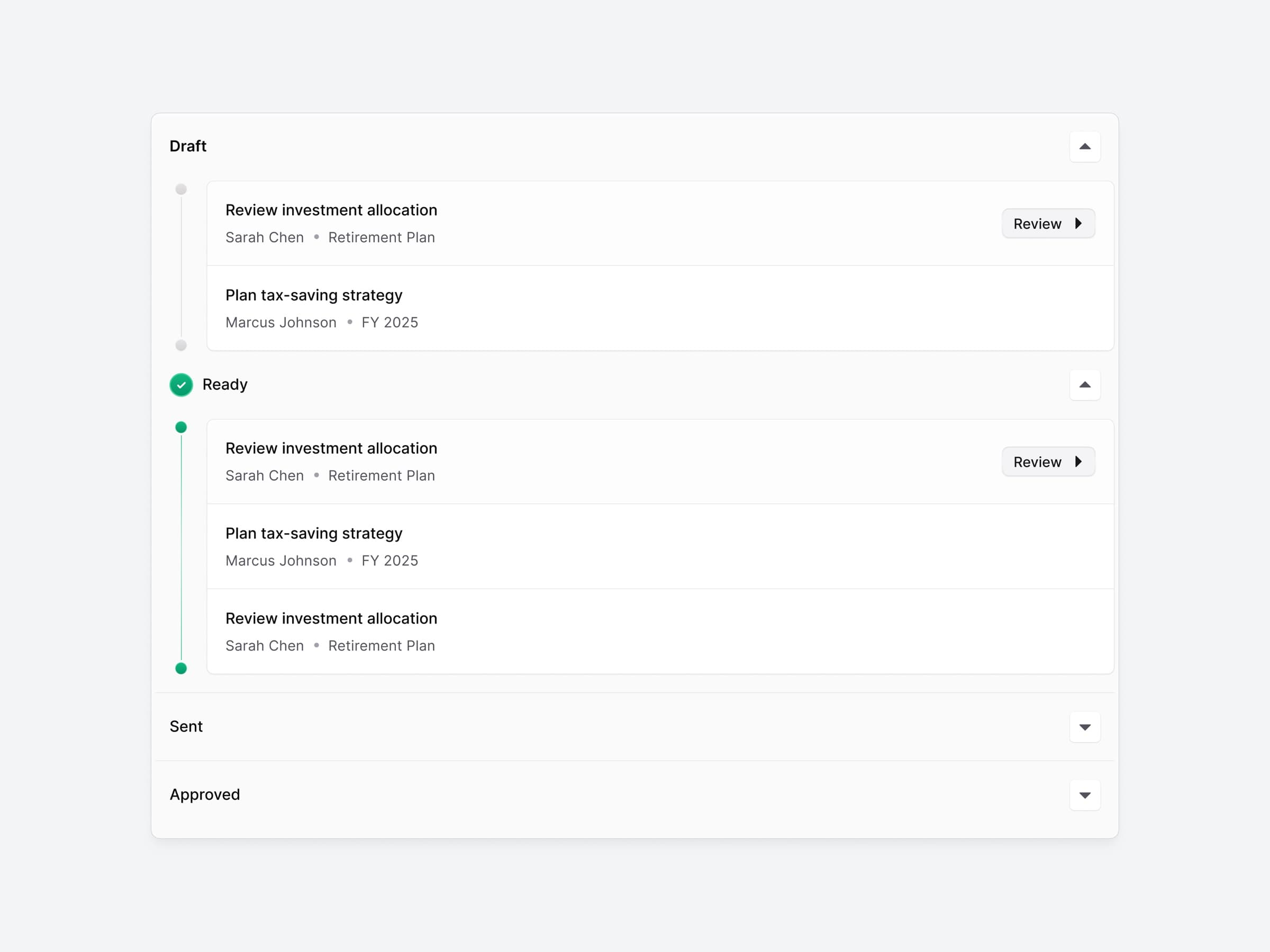
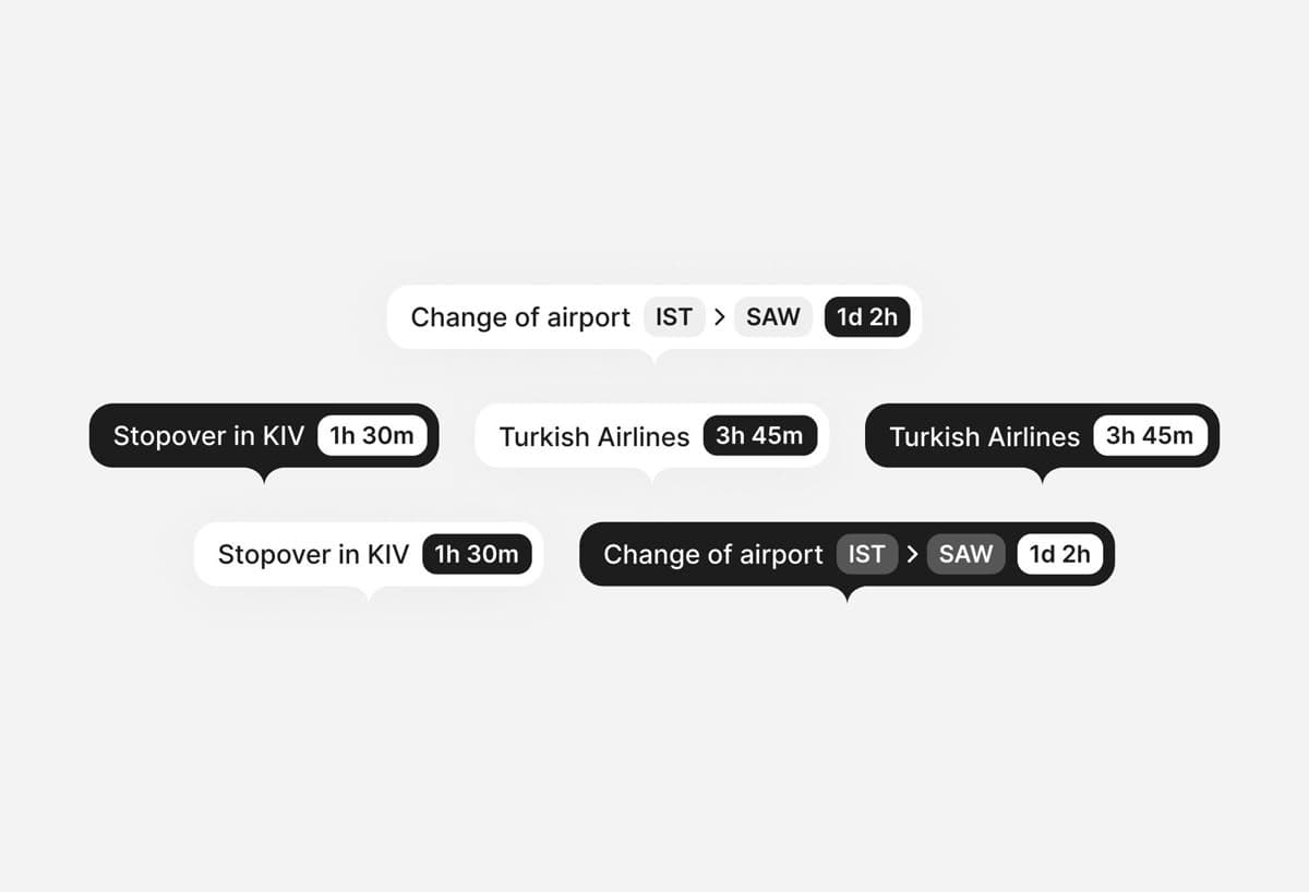
This person gravitates toward a minimal and dark color palette, favoring cool tones that enhance readability while providing a modern aesthetic. Their typographic choices lean light and spacious, creating a sense of airiness that contrasts nicely with a generally understated layout style. They prefer rounded shapes, contributing to a friendly and approachable visual language, while also incorporating a balance of depth through subtle shadowing, which adds dimension without overwhelming the clean aesthetics. Across platforms, there’s a consistent preference for airy, card-based layouts that evoke a sense of playfulness, particularly in web contexts.
“Minimalist designer who likes a mixture of Robinhood meets default iOS”
Inside Alex Kehr's taste profile
What your AI actually reads. Preferences, not vibes.
- This person gravitates toward a minimal and dark color palette, favoring cool tones that enhance readability while providing a modern aesthetic.
- Their typographic choices lean light and spacious, creating a sense of airiness that contrasts nicely with a generally understated layout style.